
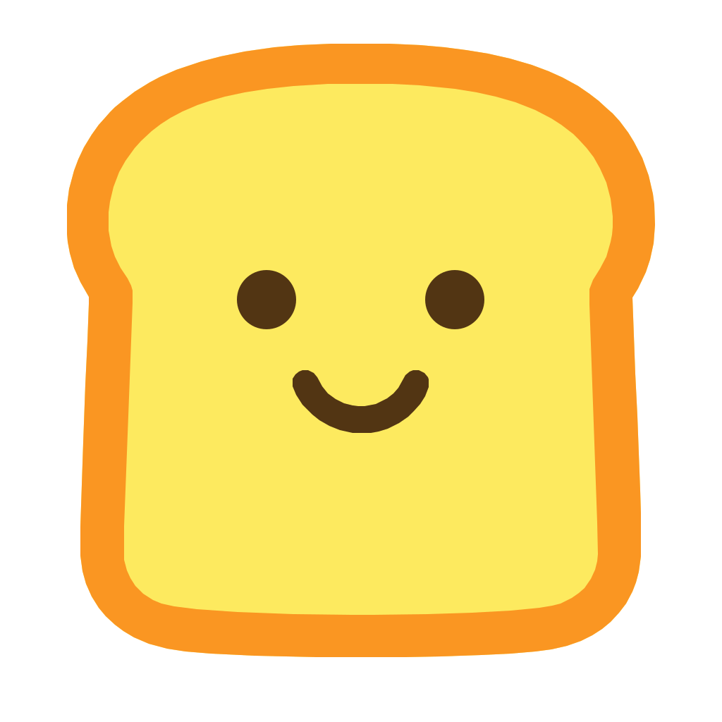
The Bredbox Philosophy
Bredbox is designed to keep saved digital content pristine and organized, much like keeping bread fresh. The name itself merges "Breadbox" and "Inbox," capturing the playful concept of popping fresh bookmarks into a safe, warm, and highly organized environment.
Visually, we avoid cold, hyper-industrial aesthetics. Instead, Bredbox implements warm cream tones, soft rounded interfaces, elegant spacing, and characterful typography to present a reading workspace that feels personal and peaceful.
Friendly & Approachable
Highly Categorized
Warm & Tactical
Typography
Bredbox uses Plus Jakarta Sans as its sole typeface family, bridging clean geometric sans properties with organic, warm character.
Headline Display
Plus Jakarta Sans
Functional Interface & Body
The quick brown fox jumps over the lazy dog.
Code & Machine Markers
monospace / SF Mono
Color System
Our primary palette adapts to the active theme. Select any swatch below to copy its hex value to your clipboard.
Light Theme
#FFF8F1
Dark Theme
#111412
Official Logo Assets
Grab official vector and raster assets straight from our CDN. Prefer the vector (.svg) formats for web and app use since they scale perfectly across displays.

Logo Usage Rules
A few simple rules keep the toaster mark looking sharp everywhere it appears.
✓
Do
- Keep generous clear space around the mark, at least half its own height on every side.
- Use the original vector files unmodified so edges stay crisp at any size.
- Choose the light or dark logo variant that gives the strongest contrast against its background.
✕
Don't
- Don't stretch, squeeze, mirror, or otherwise distort the toaster shape.
- Don't recolor the mark outside of the approved brand palette.
- Don't rotate the mark beyond a subtle tilt (±6°) reserved for playful, temporary states.
Full usage checklist
- Always supply generous exclusion margins (clear space) equal to half the height of the toaster logo around any placement.
- Use vector SVG logos for modern web displays and screens to render crisp assets.
- In dark system modes, prefer the bright neon primary teal or white text colors so everything is easily legible.
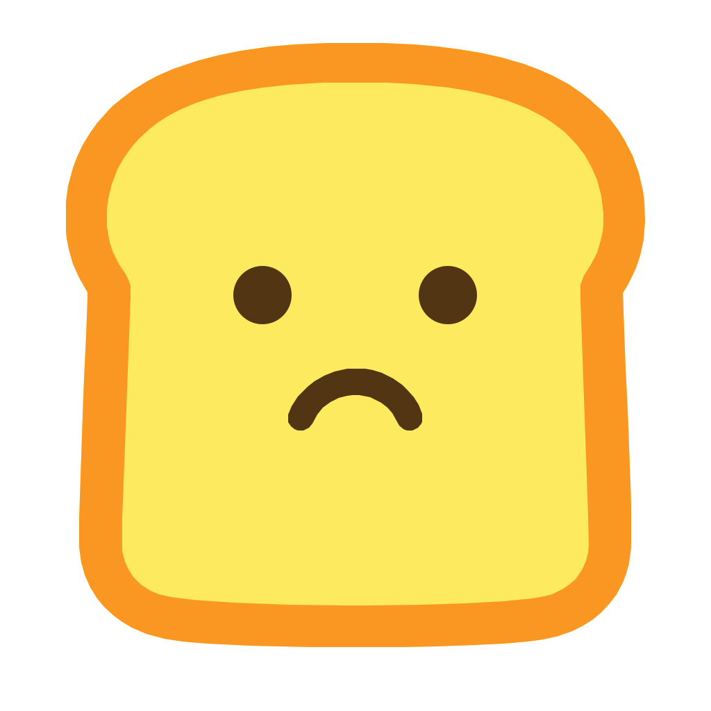
- Do not stretch, shear, mirror, or squeeze the toaster or frowning logo shapes.
- Do not alter the primary logo colors or combine them into unapproved gradients.
- Do not rotate the toaster excessively (max acceptable rotation is ±6 degrees for fun active states).